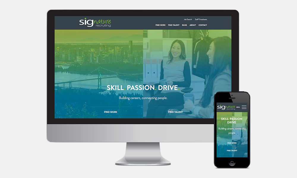
The original SIGrecruiting.com was built when we first started the company in 2010, and it was a good, solid website at the time.
The primary reason we started talking to web design agencies was to make it easier for applicants to apply for our job postings. We started realizing, though, that we were really underutilizing our website, which should be our best online asset.
There were a number of deficiencies in our old site:
- The way it integrated with our applicant tracking system made it cumbersome for job seekers to apply to our jobs.
- We had very poor keyword SEO; type “Vancouver IT recruitment firms” into a Google search and we were non-existent!
- We weren’t giving anything back to the community via our website. One of our core values is to provide value to each person we interact with. We advise our clients and candidates on best practices, but this is typically over the phone or in person.
- Our team members were relatively active on social media, but our activities weren’t directing people back to our site.
- Our website was not mobile-friendly.
- There was no personality on our site! The Vancouver recruitment industry is about relationships. If you are a client or candidate looking for a recruitment partner, it’s important to know who you’re working with. Our old website was filled with stock photos and standard text that had become stagnant.
We met with a few web design agencies and chose Forge and Smith to be our partner. Their portfolio was impressive, and the passion for what they do really resonated with us. Their digital strategy goals for us were:
- Improve overall aesthetic and user experience, and make the site more engaging and professional
- Improve content strategy and site navigation for better accessibility on mobile devices
- Improve site conversion of users into contacts and ultimately customers
- Reduce the amount of time it takes to enter a job application
- Dramatically improve SEO performance
- Implement a fully responsive solution backed by WordPress CMS
So what does our site look like now? Aside from a home page which better tells our story and, of course, our Contact Us page, here’s what you’ll see:
- A blog area to include news, articles, and other important announcements
- An “About” area with a section for the SIGnature Recruiting team member bios, so that you learn a bit about who you’re working with
- Client and Candidate Services pages to give you an idea of the process when you work with us, along with testimonials from others who have been in your position and benefited from our services
- An easier and more user-friendly job application process
- Easier navigation through your mobile phone
We can’t wait for you to come by and experience our new website! We hope to offer you useful, valuable information and tips for your job search or recruiting strategies. We’re happy to hear any feedback you have!


